Blues in Greens, Greens in Blues:
Color as shape, painting as architecture
For the leaf: green
For the sky: blue
For the rose: rose
For the sea: blue
For the gray: gray
For the sand: gold
For the earth: brown
For the earth: blue
(What colors are your favorite colors?)
Rai das Cores, Caetano Veloso[1]
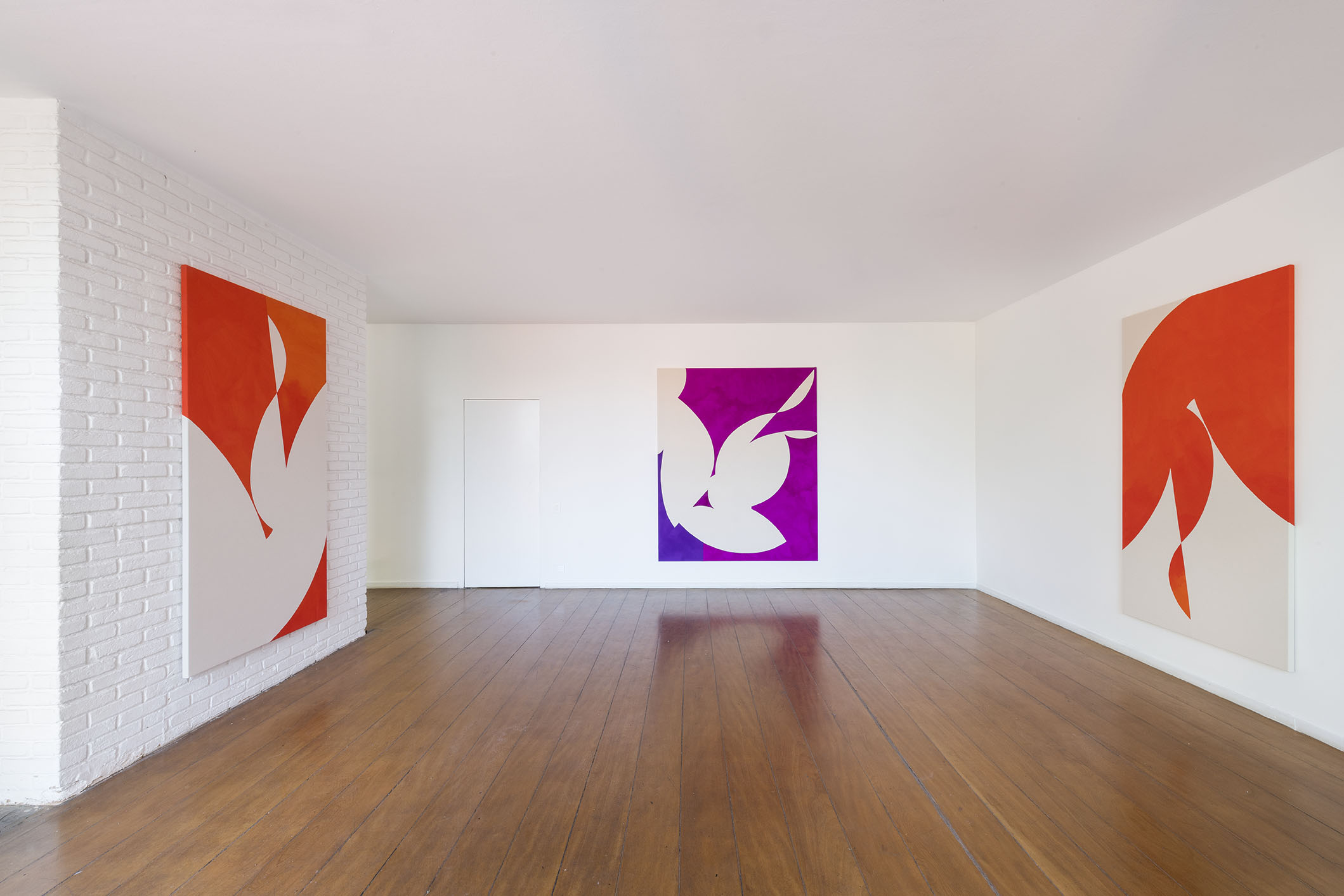
Finding an objectively sensitive, synesthetic, and seductive relationship between material and technique, shape and composition – modulating and implicating art in a place where it is made public – seem to be a primary desire of American artist Sarah Crowner (1974). This is something that is underscored in what visitors are shown: her first exhibition in Brazil is being held in tandem within two different architectural contexts in the city of São Paulo – two modernist houses, with different floorplans and modes of use, but both possessing generous devices for integration with the outside environment.
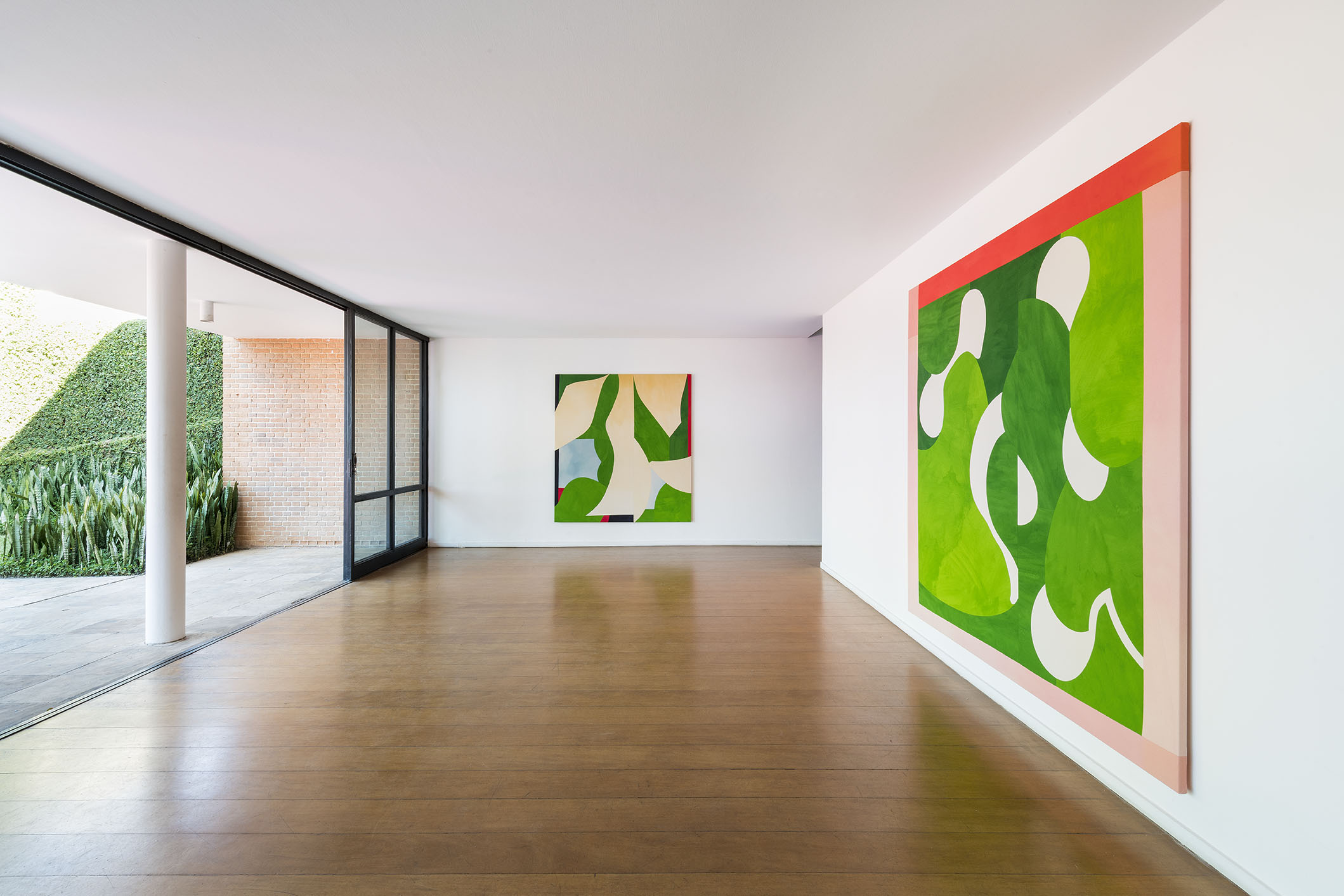
It is in painting – in all of its physical and symbolic amplitude – where the initial gesture of the framework of gathered objects finds a home. At first sight, the abstract environment, at times geometrical, at other times curvaceous, stands out in the works shown by the artist. The distance of the observation reiterates the framed area of the two-dimensional canvas, whose interior offers us a dance of shapes, a puzzle of colors that are arranged with empty spaces of beige or of white itself. These are modulated and vibrant arrangements that combine with landscapes both warm and cold, bustling or still: a sort of rhetoric of movement that opens a dialog with the domestic environment of the home, a place, for instance, that houses auroras. There is thus integration between a rational inner richness and the richness of the predominantly green exterior landscape and the pool’s blue tone.
Contemplation of each of the items installed suggests unique universes, whether because of the leading role of islands of color, or because of the balanced or unbalanced arrangements of starkly defined geometric bands. The execution of each work of art immediately jumps out and gains even more energy during each person’s interested and close observation. We therefore find ourselves drawn to the same seductive exercise of predilection.
Beyond this, there is another visual immersion that we receive from observing the whole: identification of possible pairs, of contrasts between them; of formal dialogs through opposition or approximation; of the synesthetic recognition between what you see and what is produced as a feeling or meaning; of what is envisioned as comfort or the urge to live; of what seems to go with the architecture of the place, its empty and full volumes, opacities and transparencies, permanences and transitions.
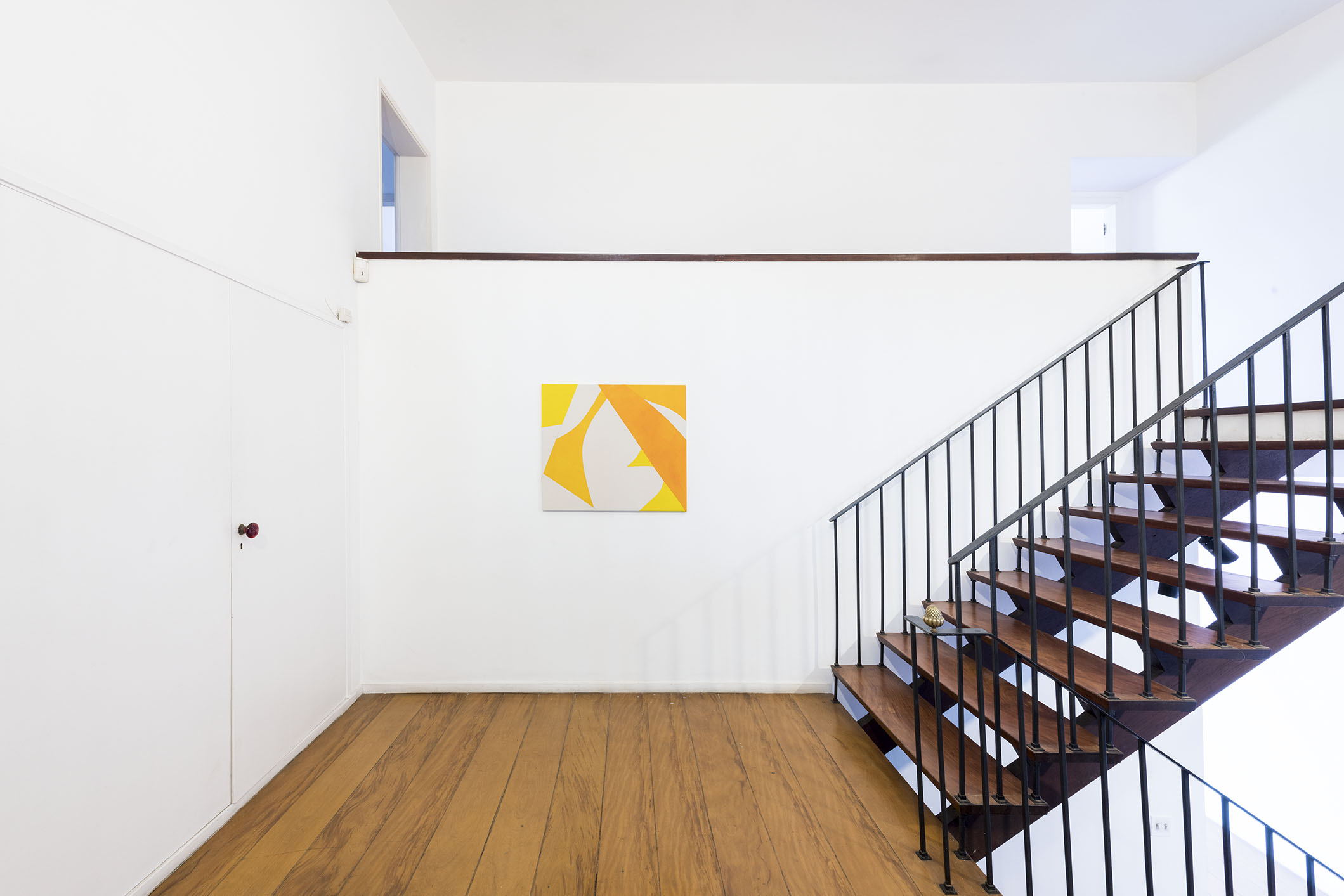
Look: it’s not an ornament, but rather a desire made up of integration and experience between art and architecture, a search which is at the root of a modern fable and that has continued in the history of art for over a century. Crowner has a complete intuitive awareness of this. “Forming is integrating,” (check English translation of this) as French-Swiss architect Le Corbusier said at the dawn of the twentieth century. The installation of seven paintings in the auroras space, one of which is a diptych, gives the work a performative and architectural feel.
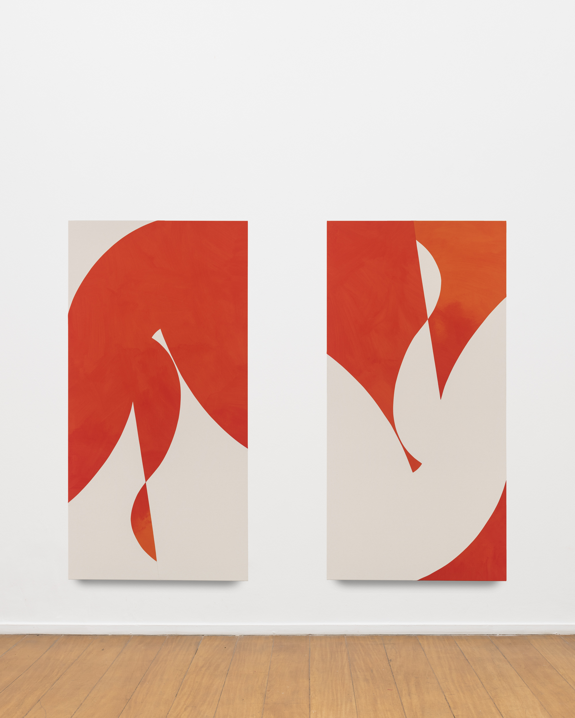
In Lovers Up and Down, for example, the very use of the diptych, positioned between transversal walls, represents a type of spatial volume that involves the observer. Something that the artist has been stitching together in her wide variety of exhibition experiences in recent years. Just look to the results of her solo exhibition, Beetle in the Leaves, at the Massachusetts Museum of Contemporary Art (MASS MoCA), in 2016, where she showed two-dimensional works with some compositional patterns used in making the paintings and in the tile floor, while at the same time exercising a dialog with the architectural body of the venue.
So look again: let’s try to move close to each of the works assembled here. The intimate movement with the work reveals a new frontier to us, better yet, an intricate game of frontiers in the apparent unit of a large canvas. That which seemed to be the painted object, with all of the symbolic burden that this sign holds, is actually a huge formal puzzle made up of parts, scraps, pieces, regions, and modules that are sewn one next to the other. The seam’s frontier is a territorial mark that separates the units of a generous quilt of painted scraps. This technical perception of Sarah Crowner’s work questions and perverts the very language of painting, moving it closer in scale to the nature of panels or murals. The movement she promotes, from an initial wonder to moving toward some sort of functional condition of the work of art, seems to be her intuitive gesture of relevance. We will return to this point when we talk about the scale of the architectural space.
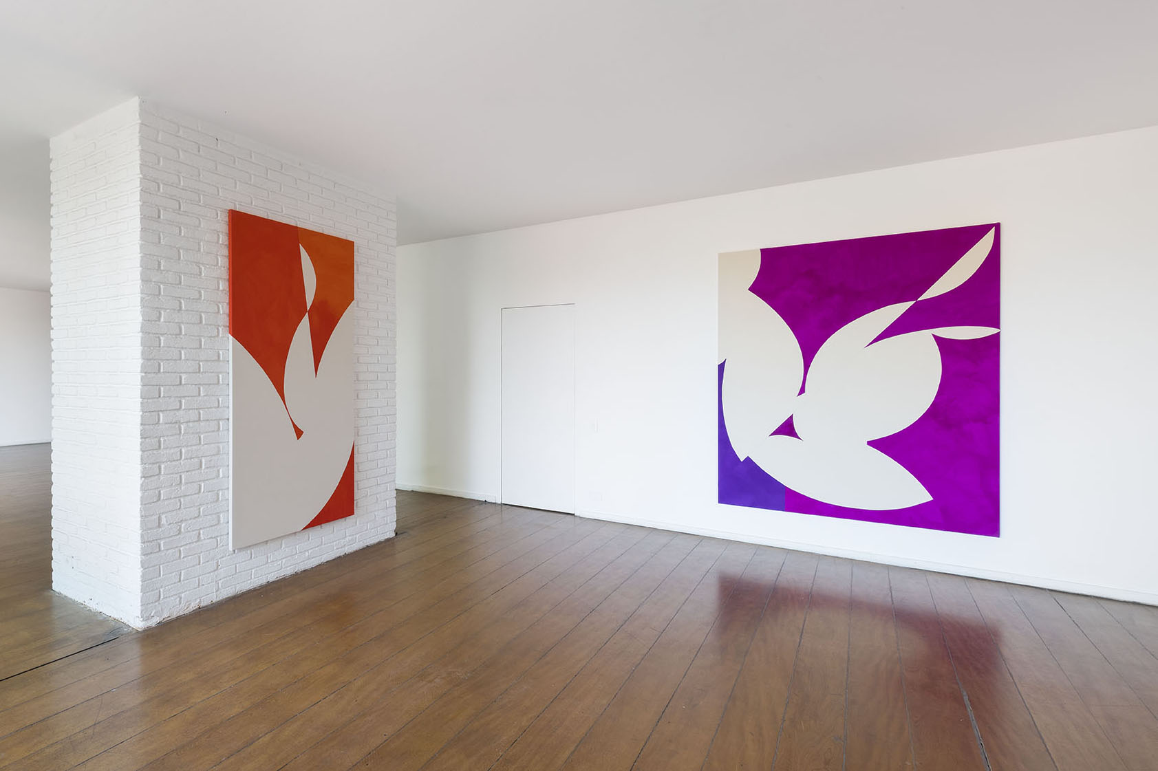
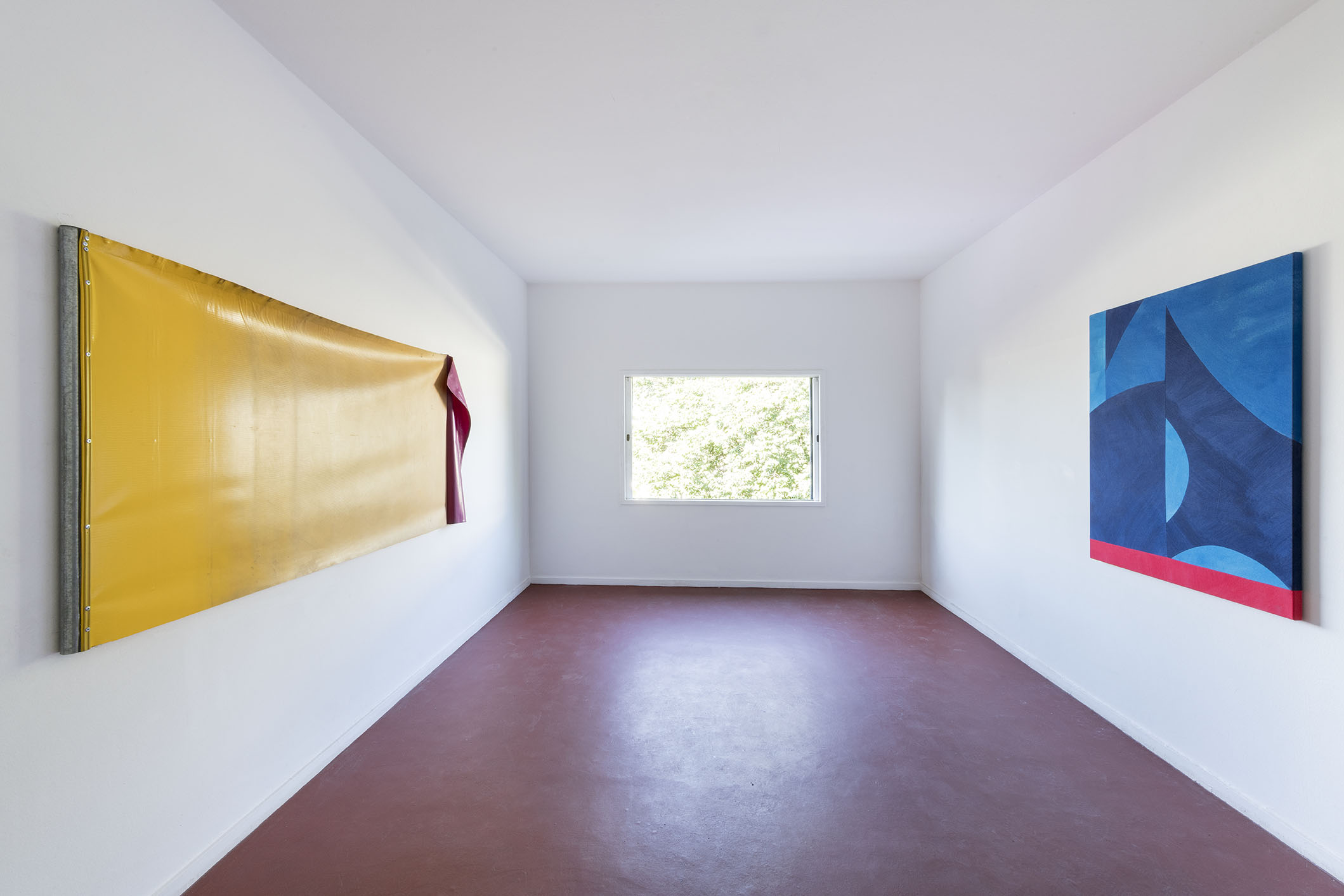
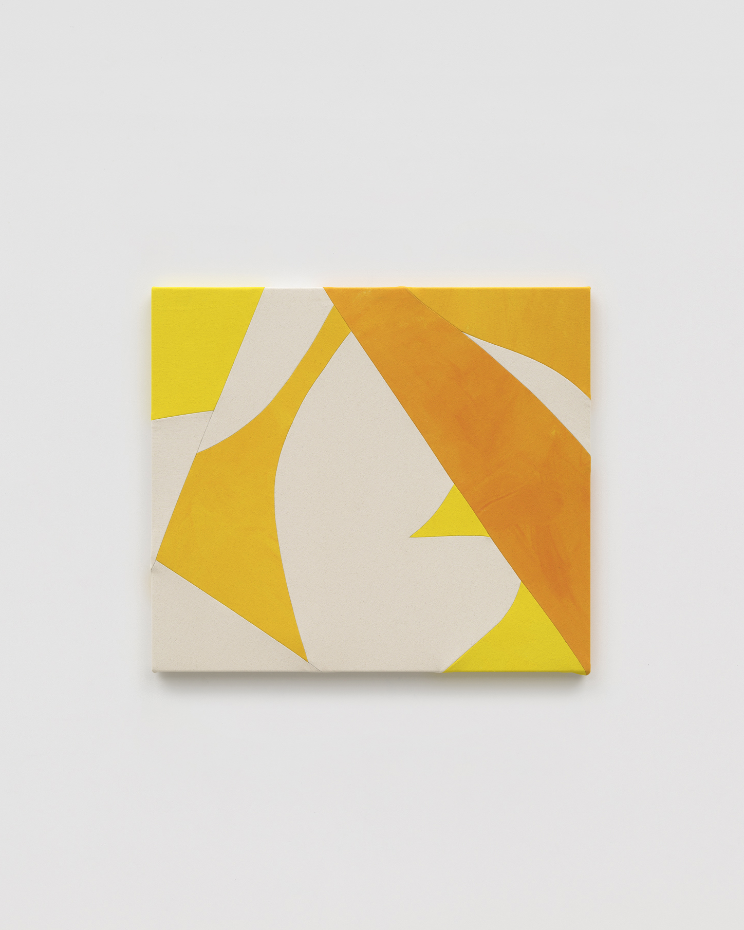
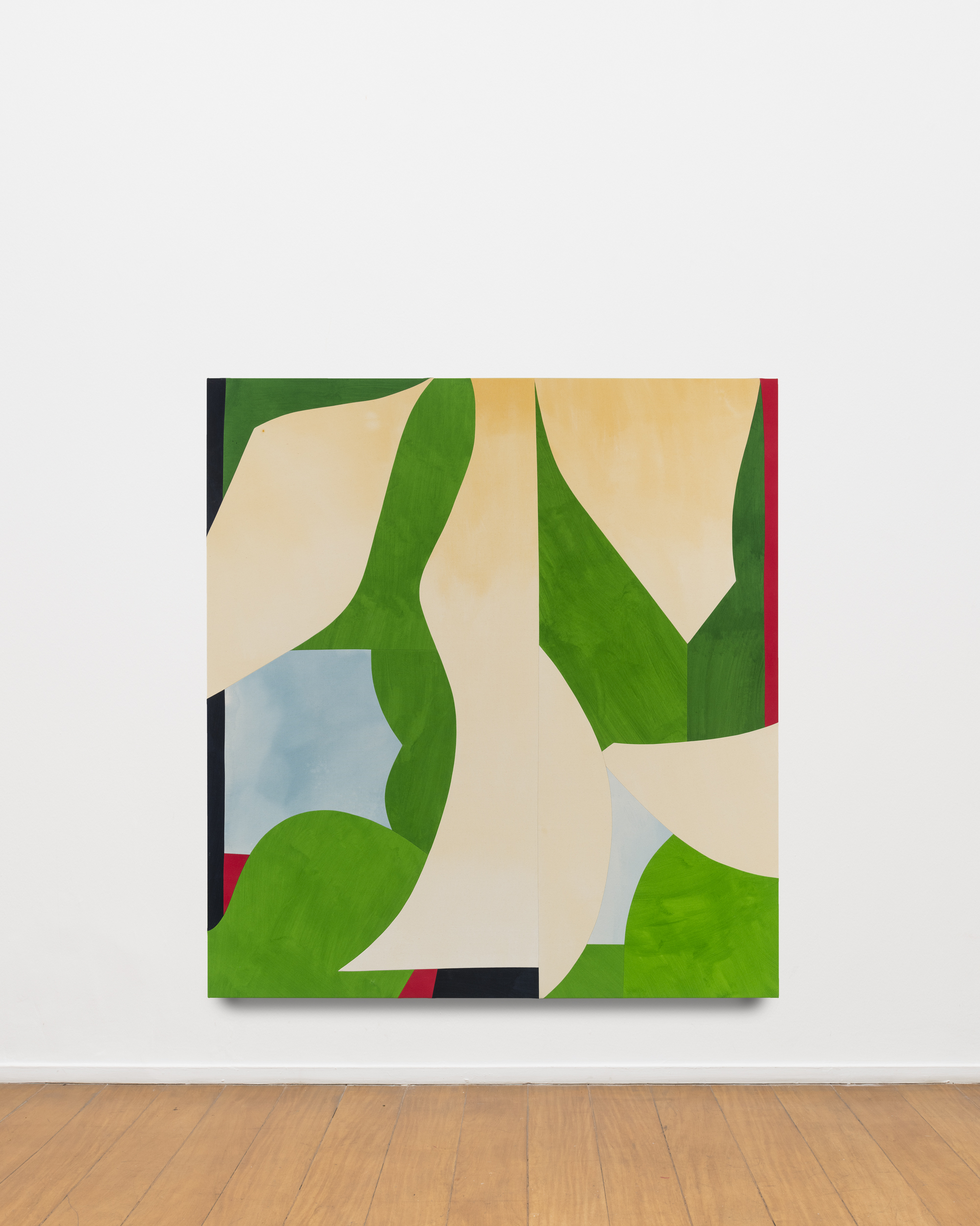
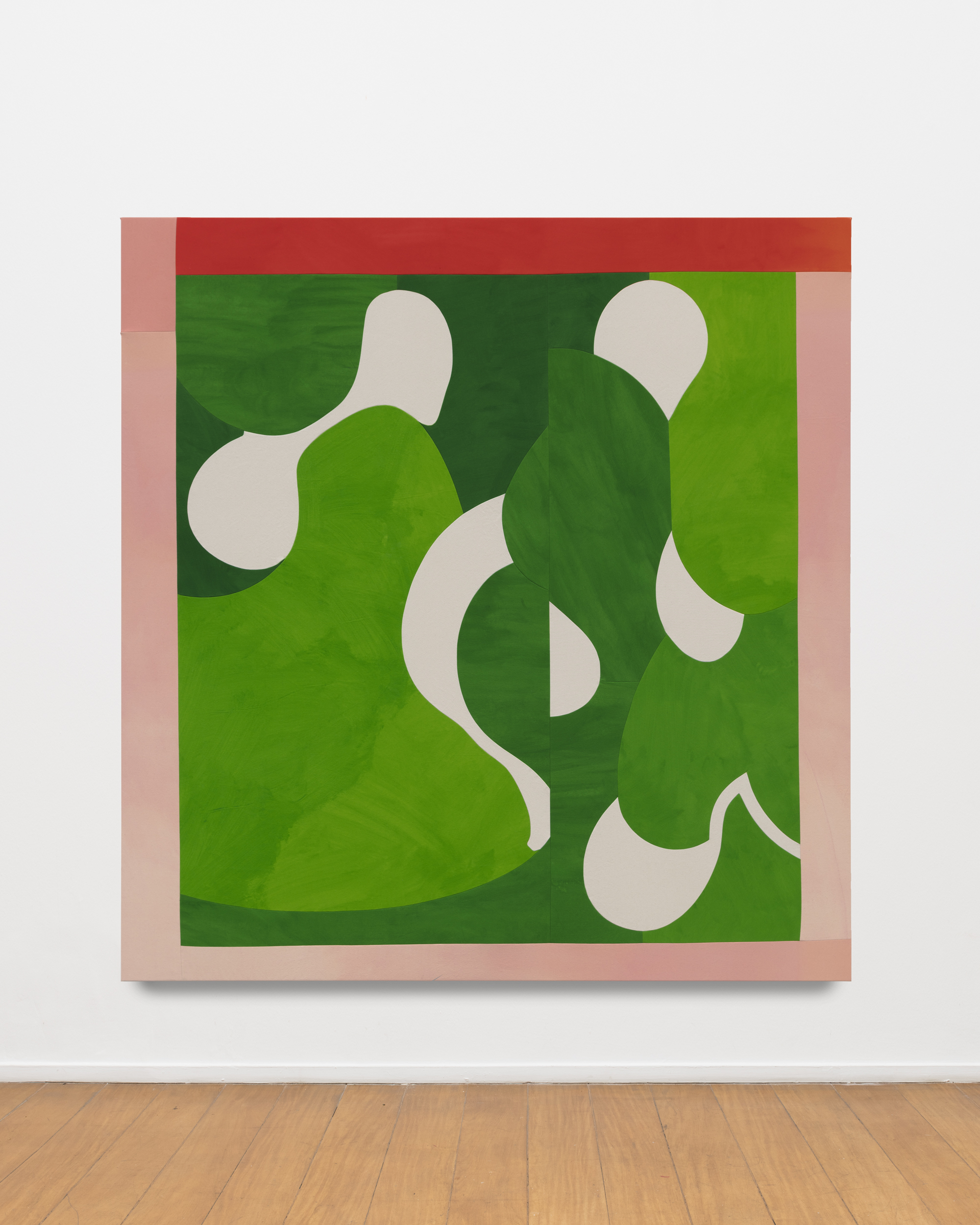
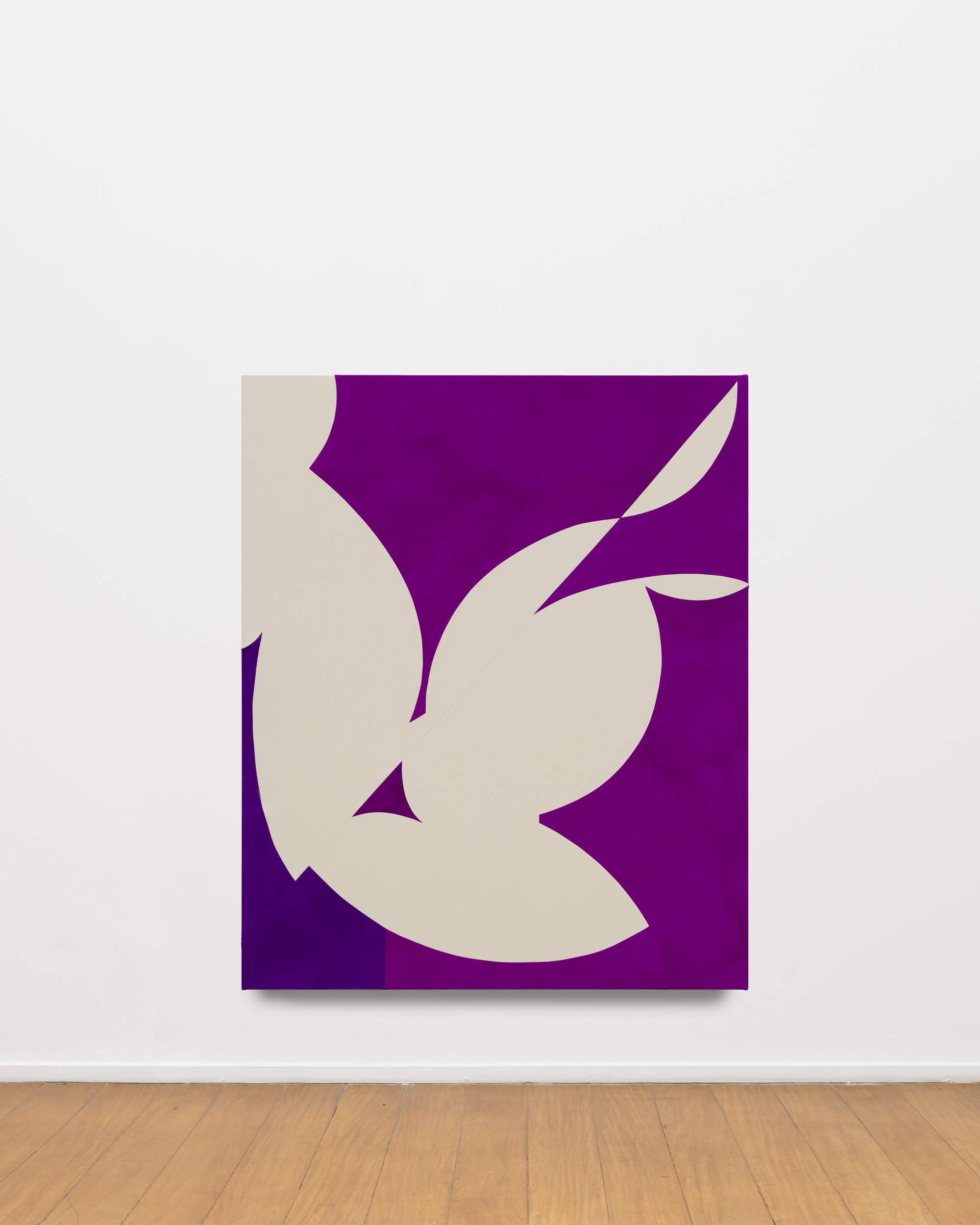
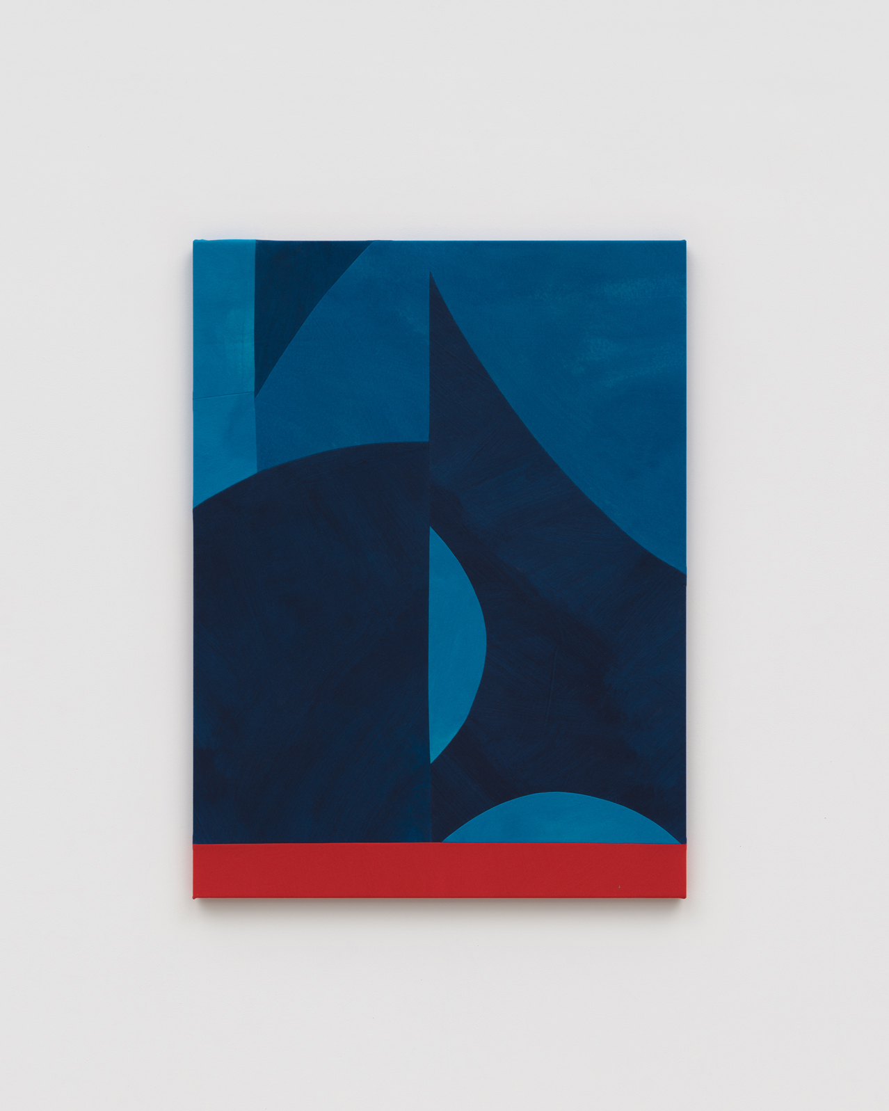
First, I will risk calling the work shown “canvas panels.” Some more vertical and others more horizontal, these large-scale paintings seem to have been gestated like a choreograph of monochromatic shapes, with some variations in intensity and tone, and they mix and combine in a two-dimensional formulation. Mostly produced after the artist’s first visit to Brazil in 2022, these “canvas panels,” with their respective titles that strengthen each one’s meaning – Aurora, Greens Window (Brazil), Rising Violet, Lovers Up and Down, Another Green World 2, Blue Descending Staircase, and Blues With Red Margin – provide a robust understanding of the nature of the landscape, for example, giving the entity of color the leading role. Here, the seductive factor through synesthesia gains an exponential appeal and underscores the value wherein pigmentation triumphs as a perceptive and defining entity of form and volume.
It is therefore also based on this synesthetic tendency that we can see Crowner’s art as something that, in my opinion, is translated, for example, by Caetano Veloso (1942), in his song “Rai das Cores.” I immediately foresee an interesting poetic parallel – a transmutation that occurs very rarely between music and painting, between melodic modulation and plastic modulation of color. The song itself moves toward the idea of a quasi-visual poem, where signs of what we find around us are associated with colors – in a sort of ode to the very plasticity of colors. While the works installed by Crowner provide a visual and material dance of the very representation of colors – blues, greens, reds, pinks, yellows, oranges, magentas, whites and beiges.
It is as if we were to find a possible amalgam between colors and sounds, sounds and colors: a poetic path that seems to matter around here. It is said that the very term “rai” as a hub that aggregates the colors may allude to a folkloric Arab-Algerian music, but it also translates the idea of an opinion . The artist’s body of work is, in this sense, a rai of colors.
Based on the title of the exhibition, I would also like to make a short aside: it is impossible not to remember and establish an immediate association with the musical theme of “Blue in Green,” written by Miles Davis (1926–1991) and Bill Evans (1929–1980) in 1959, a ballad that was part of the aesthetical-musical revolution that Davis’s Kind of Blue embarked upon.[2] The invention in this modal jazz moment – radical harmonic changes that came out of the improvisational structure of bebop – let moods be built, more sinuous musical movements where improvisation itself would happen on the path of a simple melodic line and in variations of scale in a wide variety of ways. This opening of more fluid possibilities even led to conditions for new synesthetic games and the de-structuring of chronological and consecutive time. It is as if an endless mantra had been imposed. There is this feeling of expansion in Crowner’s artistic work.
In English, the color blue (and the use of the term “blue”) sums up a mood where nostalgia, a certain sadness and calm are triangulated. Yet when this blue is introduced into green, it gains a peaceful feeling. If “Blue in Green” can be a feeling, a melodic arrangement or an artistic composition, it is color that cuts through this protagonism of meanings: of a sound to a sentiment, of a sentiment to an excitement of color, of a color to a musical expression. It is therefore color gestated as an appropriate form.
However, with poetic license, each work opens up like a window of color(s), something mimicked in the venue where it was installed, providing a vision of the intuitive perception of this artistic practice regarding formal and functional issues of the architecture with which it is in dialog: first, the auroras space, mentioned above, a house designed by Italian-Brazilian architect Giancarlo Gasperini (1926–2020) in 1957, and, secondly, Instituto Bardi, located in the famous Glass House designed by Italian-Brazilian architect Lina Bo Bardi (1914-1992) between 1950 and 1951. Sometimes the idea that intuition is something uncontrollable or free of rigor persists in common sense. Yet Crowner shows us precisely the opposite: rigor and intuition walk hand in hand in her artistic work, which is done through connection, albeit transitory, with the architecture that houses it.
* * *
“An attempt was therefore made to place the house in nature, participating in the ‘danger’ without worrying about the usual ‘protections:’ the house does not, in fact, have parapets.”
Lina Bo Bardi[3]
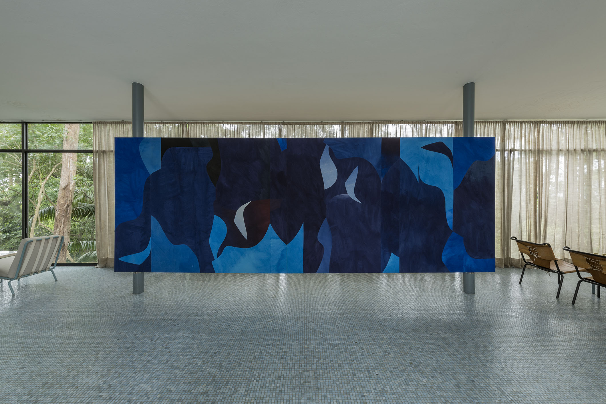
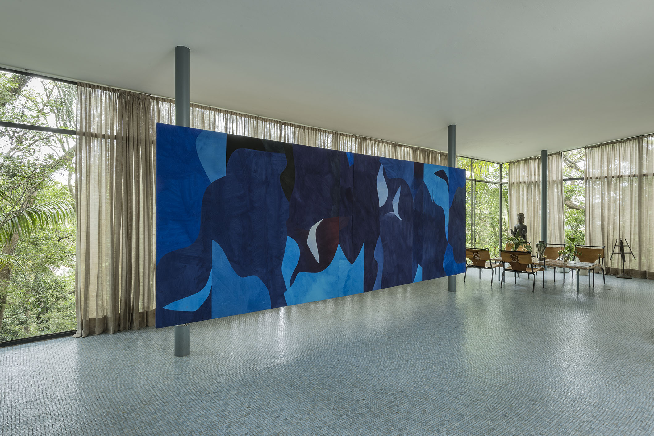
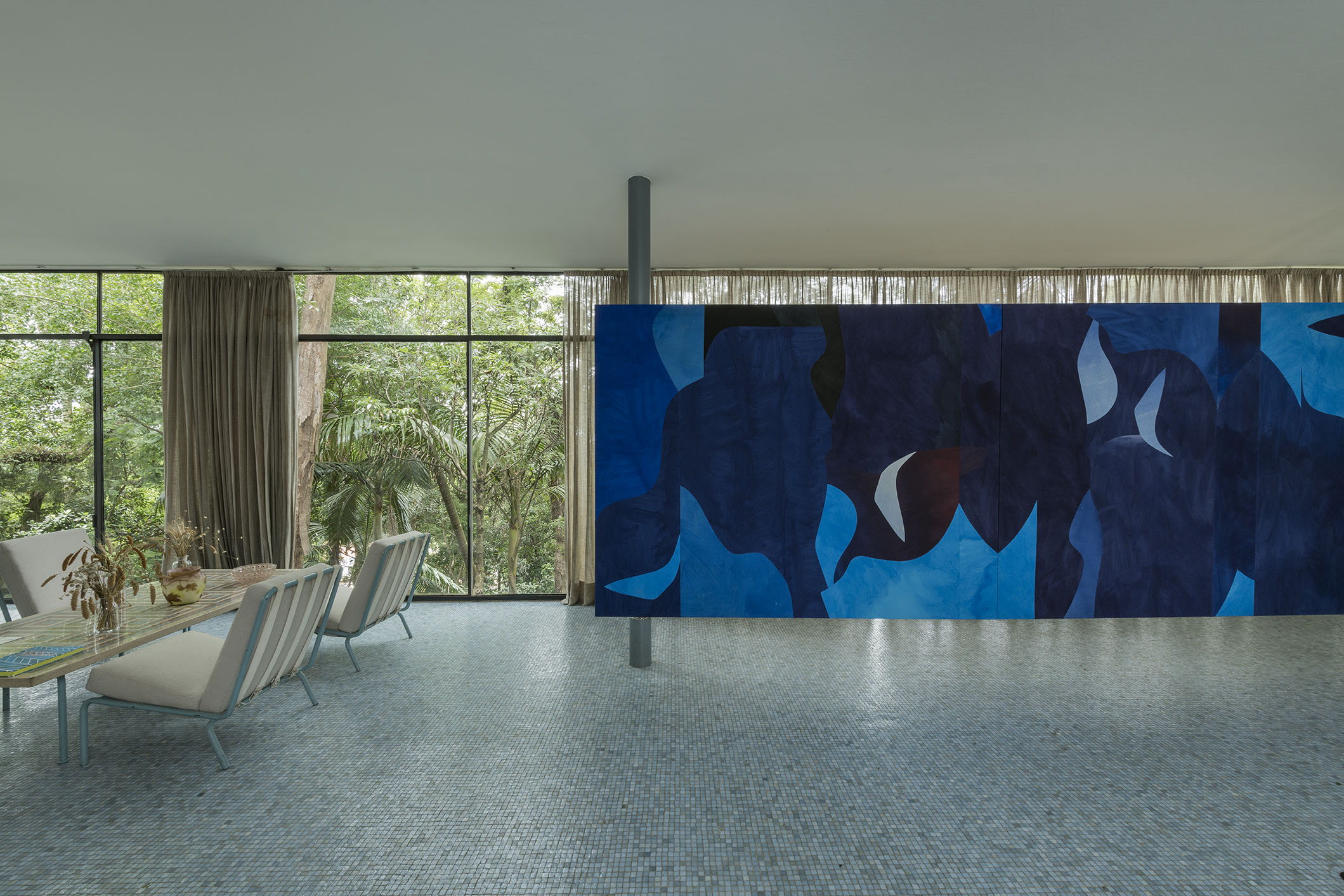
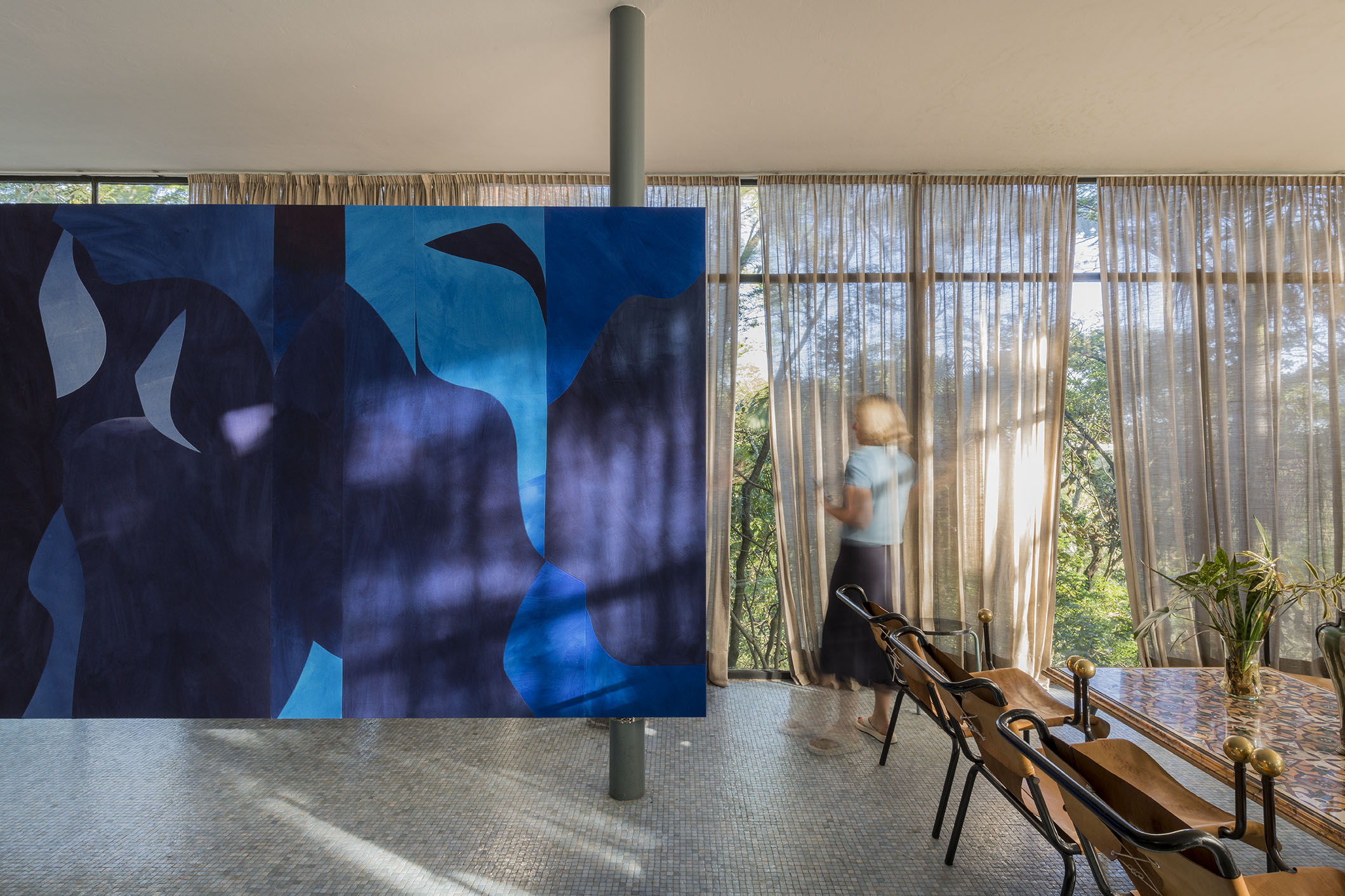
If in one house the street takes a downward path to its open spaces, coming near nature on its generous and open patio, in the other the visitor takes an upward path, and it takes place from the social intimacy of the common room and the other environments to the lush green presence that contrasts with the clear blue of the floor made of glass mosaic tiles. We are obviously talking about a perception of the spaces where the works are: first, the auroras house, and second, the Instituto Bardi house. One as well as the other are ways to frame the landscape that advocate for the precepts of modern architecture. The bands of windows and the glass doorways of both houses frame the landscape and mimic a supposed harmonious agreement with nature, making the outside closer to the inside through the primacy of vision. And this is not just an idyllic relationship with the natural world, but the opening up of a possibility for contamination and adaptation, which are characteristics inherent to modernist houses around the world.
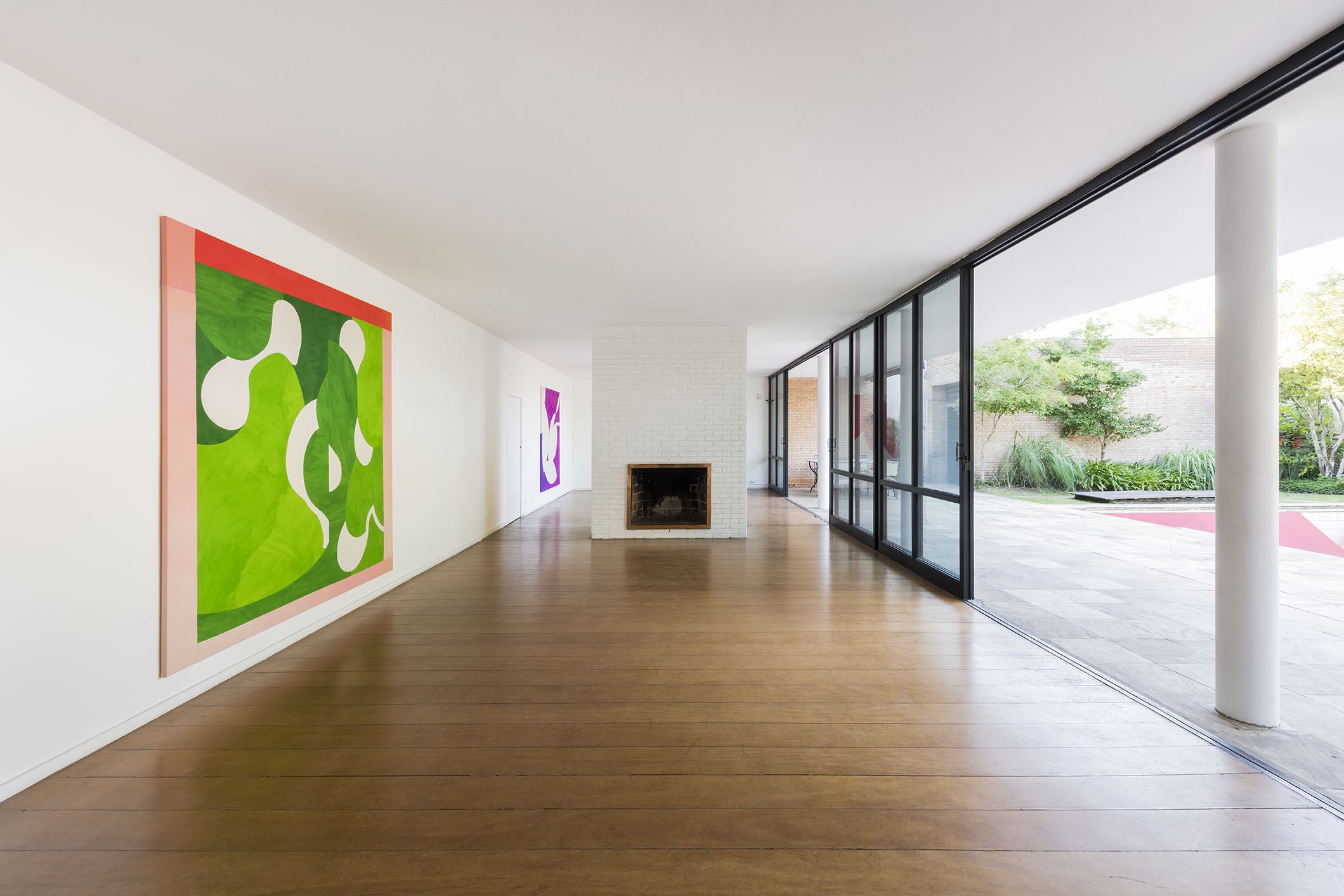
Considering that architecture deals with the matter of the landscape as a mediating device between the outside and inside, the public and private, the visible and invisible, hot and cold, among other dualities, the artist finds her way of subverting this landscape that is found in loco, knocking this mediating nature of the edified body off balance. Two of the works presented in the auroras space translate this type of window onto the lush green: in a certain sense, Greens Window (Brazil) and Another Green World 2 are openings onto the artistic world of nature, seen from the parapet of a window frame or from the threshold of a door. While the meeting with the sky and the mirrored surface of a pool is, in turn, corroborated by the work Blues with Red Margin. The red alludes to the perception of a limit, an intermediate place of architectural forms and the margins of the painting.
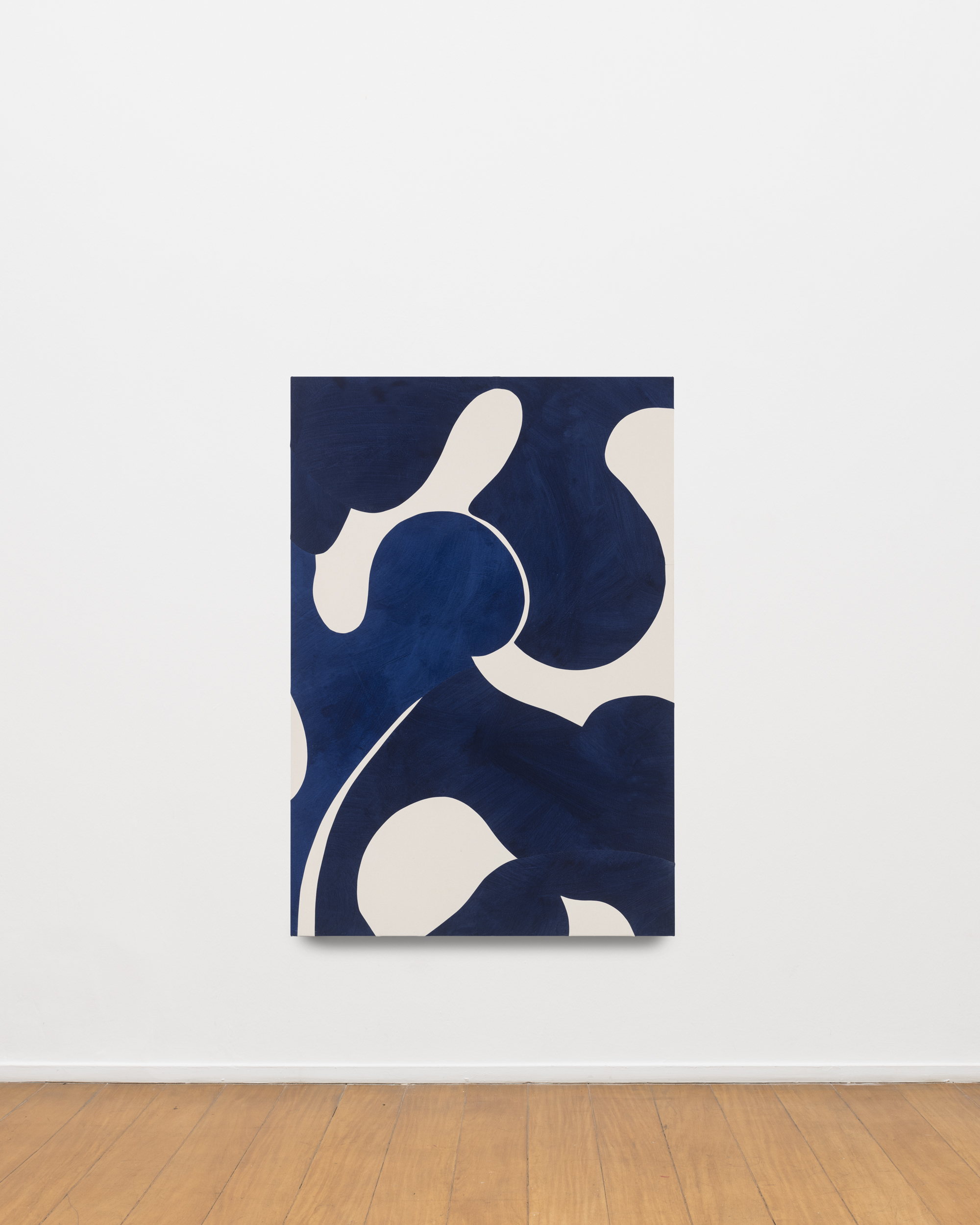
While for the Glass House, the artist executed a larger installation that has a functional similarity to the idea of the panel, respecting the house’s horizontality and transparency. The work Blues for Lina was conceived in her communion with the home’s environment – a space surrounded by the dense green of the forest and internally covered by the cool and calm of the light blue tones of the floor. So in this context the play of light that then appears generates an interspersing of blue with green. The work’s nearly six meters in width define a movement through the house, highlighting the very idea that Bo Bardi evokes of “participating in the danger,” at the scale of each person’s body. Although ephemeral, the work gains adherence to the place and begins to act in it. The feeling is not that there was an exhibition space conserved there, but rather that the idea of coexistence and presence is accentuated, while at the same time the sky meeting the leaves on the tree tops marks a transition in the symbolic field between greenish blue and bluish green. It is from there that the formation of intimacy is derived between the edified body and the painting.
Intuitively, Sarah Crowner subverts the very meaning of “synthesis of arts,” one of the foundational powers of modernism. At first sight, many of her works recall, for example, a poetic world of major figures in Brazilian art and architecture, such as Roberto Burle Marx’s landscape compositions and Athos Bulcão’s large panels in Brasília. This art from the past and today act at the confluence with the architectural object in which the possibility is extended through patterns and starting points that grow, construct combinations, and are blown up in scale. Nevertheless, the artist insists on the unpredictability of the curved deviation.
Crowner creates worlds in the very environment held on a canvas, on a wall, or on a floor. The artist’s work craves the modern spirit, yet it anchors it in contemporary urgencies and is free of nostalgia – the plastic and visual arrangements proposed can even have a point in the light of rationality, but they also experience arrangements of more complex geometric shapes, oftentimes born of mathematical complexities or of the mere dreamlike intuition of the individual who is bombarded daily with print or digital images.
There are also healthy forays into art history, in the appreciation for legacy that she has captured, now more clearly crossing the paths of recent art history in Brazil. Lygia Clark’s first constructive investigations, her modular surfaces, are always mentioned by the American artist. This information evokes a will to approximate her to other productions that have already made history in Brazil: the elegant geometries of Judith Lauand (1922–2022), especially the abstract productions of the 1950s and early 1960s, and Marianne Peretti’s (1927–2022) glass and panels, as found in the stained-glass windows of the Cathedral of Brasília, with its blue wanderings. These are references that, in one way or another, can gain popularity in the critical understanding of what is produced today.
In short, the expanded painting of Sarah Crowner is the declaration of a state of sensitivity, the combination of abstract parts that are associated with and form the composition. They are perfectly sewn parts, where any frames, profiles, or even the edge of the flat canvas itself function as a border point between the work and the world, a frontier that may someday overflow, appropriating itself of a place that belongs to architecture. This is not a desire, a conceptual objective, but rather a wish to build a danger zone that qualifies and feeds back into the artist’s research. Blues in Greens, Greens in Blues are color as form, painting as architecture: poetic and formal meetings fantasized by the artist, for now, in Brazil.
Diego Matos
January 2023
[1] “Rai das Cores” is the second song off of Estrangeiro, the 1989 album by Brazilian artist, songwriter, performer, and author Caetano Veloso. Within his vast catalog, this is perhaps one of the songs that best shows a process of artistic translation, where lyric and melody provide a movement toward painting. Moreover, this same album marks a more international phase of his music, in terms of concept as well as market. Interestingly, it was at this time when Veloso’s path veered toward American musicians and producers, such as David Byrne, Arto Lindsay and Peter Sherer. The latter two were even responsible for producing the record in question.
[2] The third track on the album Kind of Blue (1959), the most successful and influential jazz record ever, according to cultural critics, for its experimentation in weaving together a musical genre, modal jazz, and its approximations with popular music and other forms of artistic expression. Beyond the classic performance of this song on this album, there is another, equally important version played by Bill Evans, one of the songwriters, on his Portrait in Jazz (1960).
[3] Italian-Brazilian architect Lina Bo Bardi (1914–1992) wrote a text describing the design of what is now her famous Glass House, in which she discusses its functional, formal and artistic intention as a home, where she resided with her husband Pietro Maria Bardi for many years. Cf. BARDI, Lina Bo. Residência no Morumbi. Habitat, São Paulo, n. 10, p. 31-40, Jan.-Mar. 1953. In: GRINOVER, Marina; RUBINO, Silvana. Lina por escrito: textos escolhidos de Lina Bo Bardi. São Paulo: Cosac Naify, 2009.